You’ve invested in a beautiful website. Clean design, crisp branding, high-quality images—it looks polished and professional. And traffic? That’s steady too.
But leads? Sales? Demos? They’re lagging.
If you’ve ever asked yourself, “Why isn’t my website converting?”, you’re in good company. We hear this every week from growing businesses with sharp-looking sites and underperforming numbers.
The truth? Aesthetics aren’t the issue. It’s all about the user experience and conversions—how people interact with your site and what you’re asking them to do next.
Design ≠ Conversion
Design can build trust, but it doesn’t always drive action. A visually stunning site with unclear messaging, buried CTAs, or friction-heavy forms is still a broken experience.
At unFair Advantage, we help teams optimize for action, not just appearance. Here’s where we start when a site looks great but isn’t converting.
1. Your Message Isn’t Clear—Fast Enough
You’ve got about 5–8 seconds to convince a visitor they’re in the right place. If your homepage or landing page opens with vague marketing language or internal jargon, people bounce.
Fix it with:
- A headline that clearly states what you do and for whom
- A one-sentence subheader that explains the value of engaging further
- A CTA above the fold that matches the visitor’s intent (not “Learn More” unless you mean it)
Example:
“AI-Powered Hiring for Fast-Growing SaaS Teams” beats “A Better Way to Recruit Talent.”

We challenge you to run the 5-second test. Ask a friend, your barista, or your partner—someone who’s not deep in your business—to glance at your page for five seconds. Can they tell what it’s about and what to do next? This quick test reveals whether your message, value prop, and CTA are clear at a glance. If not, you’re likely losing users before they even scroll. It’s one of the simplest ways to improve above-the-fold performance and boost conversion rates.
2. There’s Too Much to Click—Or Not Enough
Some sites overwhelm users with 6+ CTAs above the fold. Others bury the only CTA at the bottom of the page.
CRO tip: Focus on one clear action per page or section.
- If it’s a landing page: One CTA—max. And it should reflect the visitor’s next logical step.
- If it’s a product page: “Start Free Trial,” “Book a Demo,” or “See Pricing” depending on the offer.
- If it’s a blog or resource: Add “Download,” “Read More,” or “Get the Guide.”
You want to guide visitors—not make them choose their own adventure.
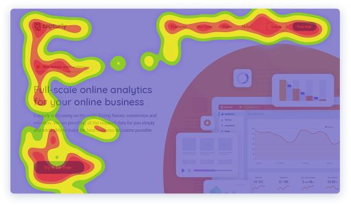
Tools like heatmaps can reveal exactly where users are clicking, scrolling, or getting stuck, giving you clear insights into what content matters most and where attention is being lost.
3. The User Experience Has Friction
You can have gorgeous typography and still confuse users.
Common friction points:
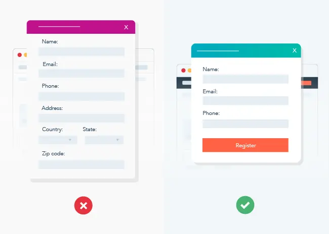
- Forms with too many fields (3-5 is typically the sweet spot)
- Mobile layouts with clunky tap targets

- CTA buttons that blend in or don’t feel actionable
- Slow page load times (especially on mobile)
Use tools like Microsoft Clarity or Hotjar to watch real behavior. See where people stop scrolling or hesitate. That’s where your CRO opportunities live.
What to Check Today
If your site looks great but you’re not seeing conversions, start here:
- Can someone understand what we do in 5 seconds?
- Is our primary CTA visible above the fold on all key pages?
- Are forms short, easy to use, and tested on mobile?
- Do we guide users through a logical flow, or just show everything at once?
If you’re guessing on these or relying on “pretty” to drive action, there’s untapped potential.
Executive POV: Conversion Is a Business Metric, Not a Design One
If your board or exec team is asking why your high-traffic site isn’t driving leads, reframe it this way:
- “We’ve identified UX issues that are blocking visitors from taking action.”
- “We’re prioritizing content clarity and CTA placement to drive conversion.”
- “Design’s done its job—now it’s about optimizing for revenue.”
That’s the language that moves CRO conversations forward.
Final Word: Don’t Let Pretty Get in the Way of Performance
A great-looking site is a good start. But if it doesn’t convert, it’s just decoration.
By focusing on user experience and conversions, clarifying your message, and guiding users through a friction-free flow, you can turn existing traffic into real business outcomes—without starting over.
We help companies just like yours find conversion gaps and fix them—fast. Read more about our user experience and conversion focused approach now!
Visit our Contact Us page to talk with our team about what’s not working—and how to make it work better.
FAQs
Q: Why isn’t my website converting even though it looks great?
It’s likely a UX or messaging issue. A beautiful design doesn’t guarantee clarity, urgency, or a clear path to conversion.
Q: What are some basic CRO tips I can apply right now?
Clarify your value prop above the fold, simplify your forms, and ensure your CTA is obvious and relevant to the page’s purpose.
Q: How do I know if user experience is hurting conversions?
Use heatmaps and session recordings to spot where users drop off, stop scrolling, or ignore key elements.
Q: Do I need to redesign my site to improve conversions?
Not necessarily. Most conversion improvements come from small updates to copy, CTAs, and flow, not full overhauls.
Q: How quickly can I see improvement?
If you implement fixes on high-traffic pages, you could start seeing higher conversions in as little as a week.